A user-friendly website delivers an accessible, seamless experience that engages visitors and encourages them to take action. Follow these five tips to optimize your site’s usability:
1. Use a Consistent Navigation Menu
Keep main navigation menus consistent across all pages so users can easily find what they need. Menu options should be clearly and succinctly labelled to avoid confusion. Organise options logically into groupings that make sense based on your content structure and user goals. For example, separate “Products”, “Company Info”, “Resources”, and “Contact” into distinct menu sections.
Limit extensive drop-down nesting under top-level pages, as too many layers can overwhelm. Stick to 1-2 dropdown levels at most. Conduct usability testing to determine optimal IA and refine as needed. Keep navigation simple yet robust to enhance the user experience.
2. Write Scannable Content
Break up text into short paragraphs with ample white space to improve scan ability. Use descriptive headers and sub headers so users can quickly grasp the main topics covered. Bullet points also summarise key information at a glance. Keep language clear and concise throughout. Eliminate unnecessary complex jargon and replace with simple terms users understand.
Well-formatted content allows visitors to efficiently scan and extract relevant details. This improves engagement and comprehension.
3. Improve Page Speed
Slow load times quickly frustrate users. They expect pages to load instantly. Optimise code to streamline processing and loading. Compress large images into more compact files. Enable caching so pages store locally rather than reloading assets. Check site speed and optimize servers.
Fast page speeds enhance user experience and also boost SEO rankings, since speed is a factor search engines evaluate.
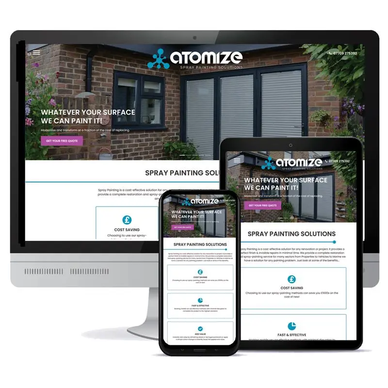
4. Use Responsive Design
With mobile usage surpassing desktop, responsive design is a must. Websites that dynamically resize and rearrange content to optimise viewing on any device prevent awkward tiny/squished text. Test the responsive experience on multiple devices to catch formatting issues.
Consistent navigation, readable text and fast speeds should be preserved regardless of the viewing device.
5. Include Strong CTAs
Compelling calls-to-action tell visitors exactly what you want them to do next. Phrases like “Start Free Trial” or “Add to Cart” work better than generic terms like “Submit” or “Learn More.” Place CTAs strategically in sidebars, site headers, page footers, and at the end of high-value content.
Make them visually stand out through contrasting colours, borders and buttons. CTAs guide users through conversion funnels.
Keeping user experience at the forefront when designing websites minimizes frustration and maximizes conversions. Follow these tips to create an intuitive site that effectively caters to all visitors.